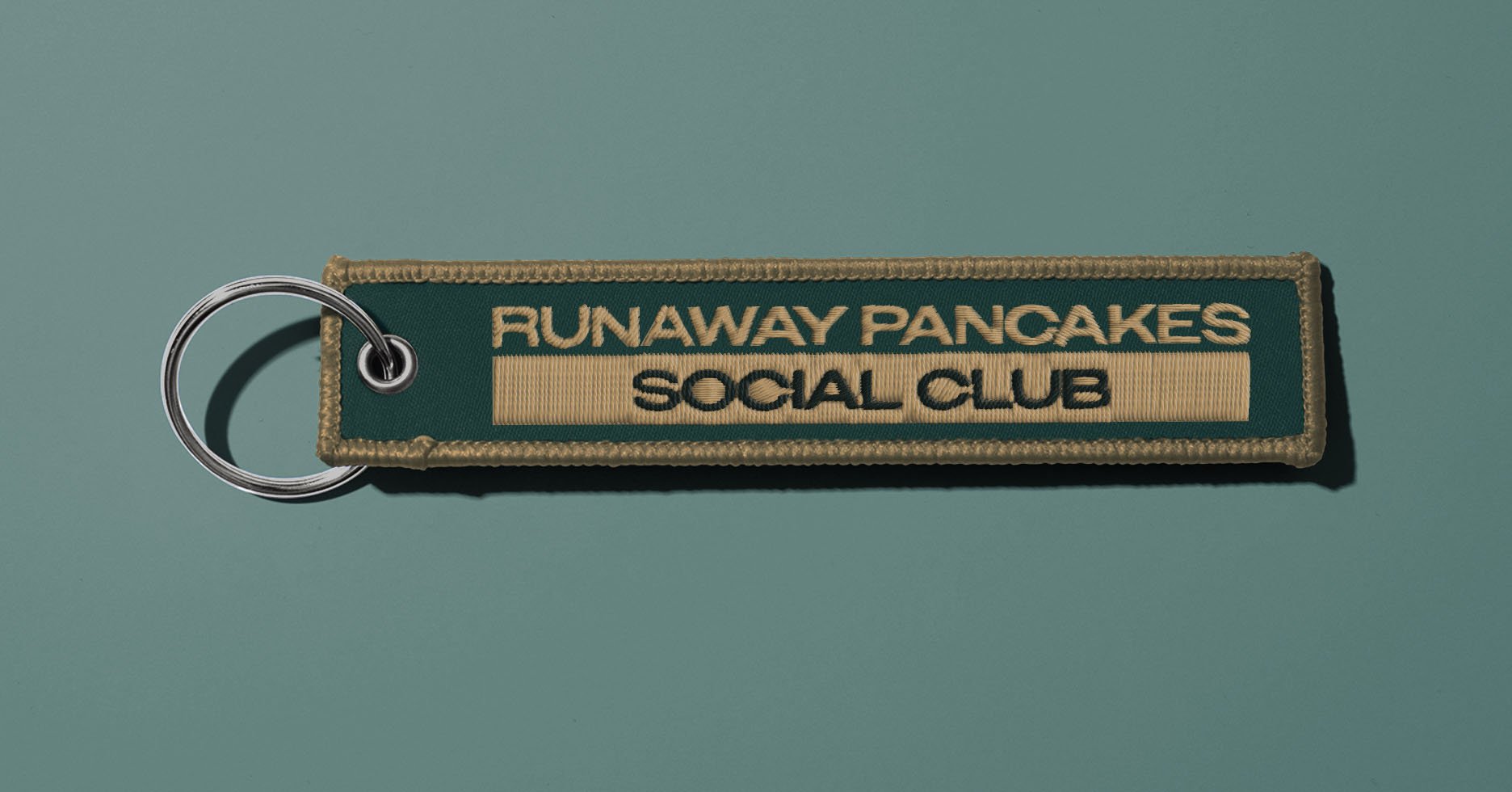
THE RUNAWAY PANCAKES
The Runaway Pancakes is a car club built around a shared passion for Japanese tuning culture, motorsport heritage, and the thrill of spirited driving. The club wanted a visual identity that reflected both its roots in underground car culture and its modern, forward-looking mindset.
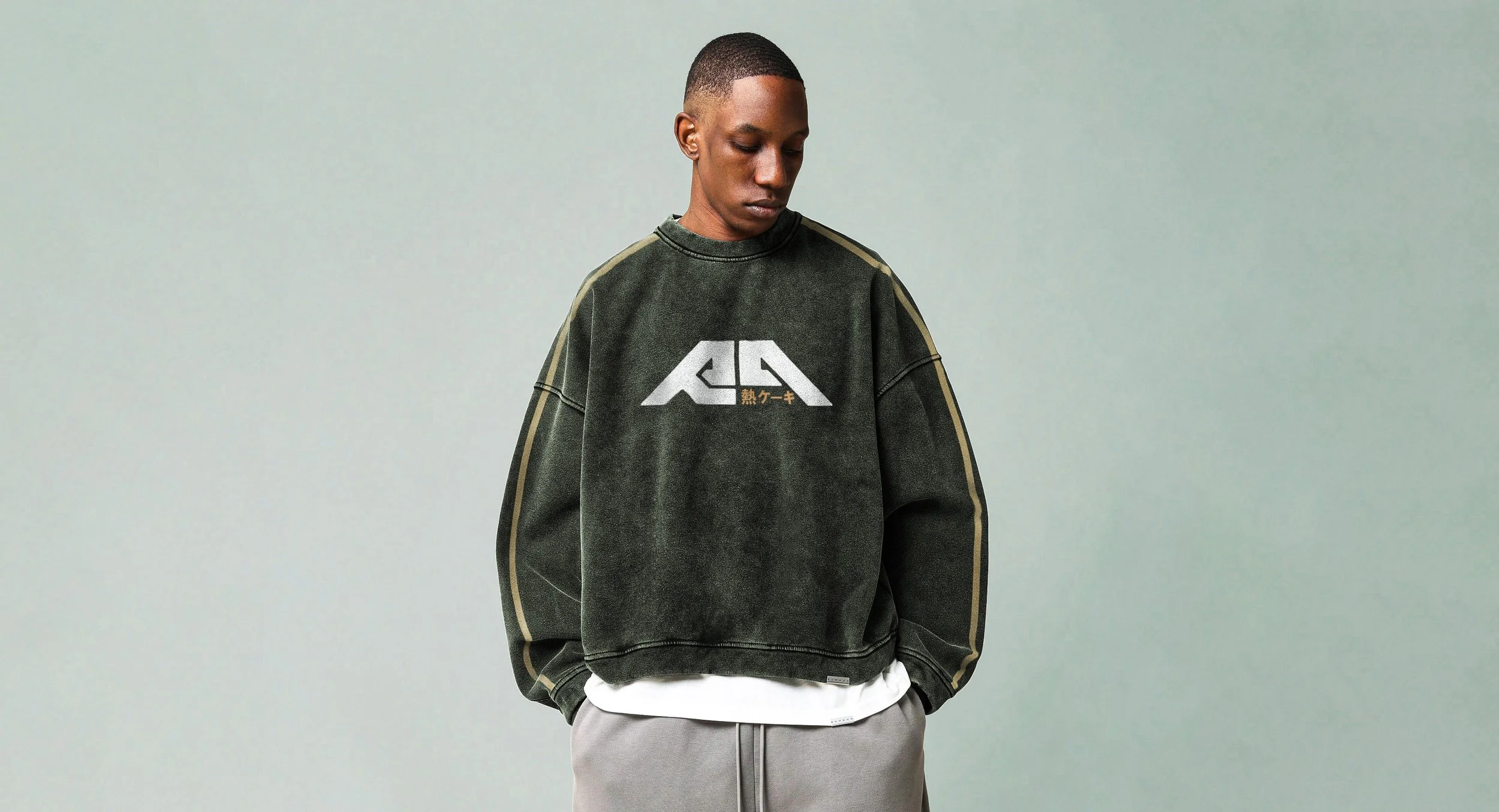
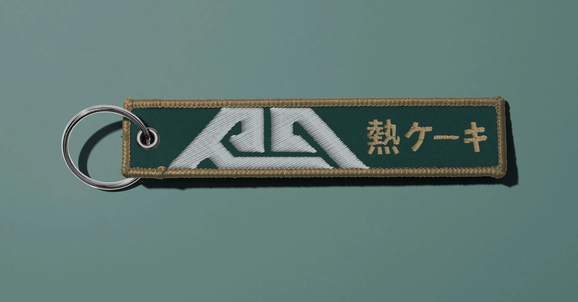
This branding project builds that identity from the ground up. Drawing inspiration from Japan’s racing scene, it uses the deep green and bronze palette of the Toyota GR86 Hakone Edition to create a look that feels both classic and contemporary. The Japanese text “熱ケーキ” (“Hotcake”) reinforces the name while nodding to the group’s connection to Japanese street racing culture.
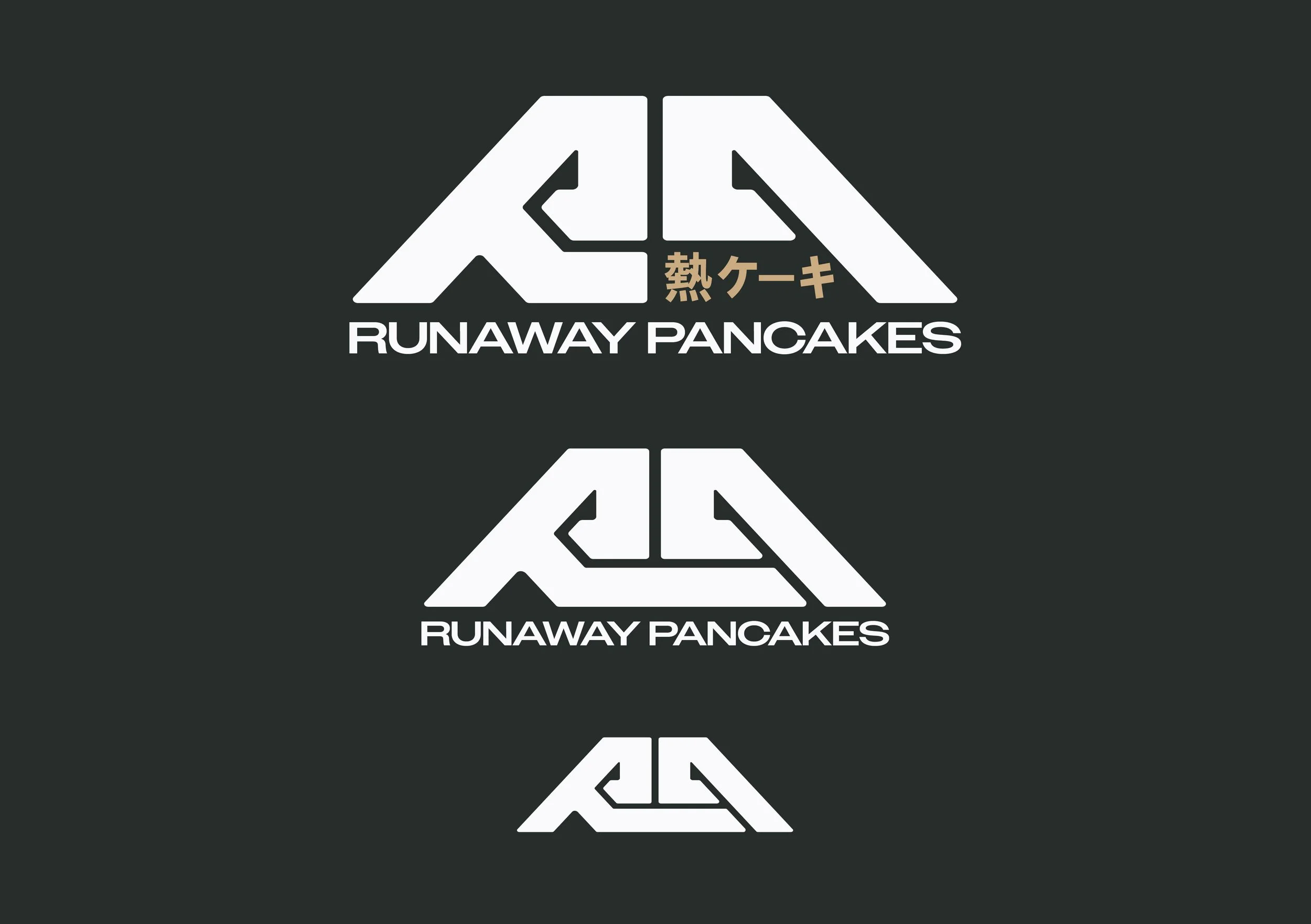
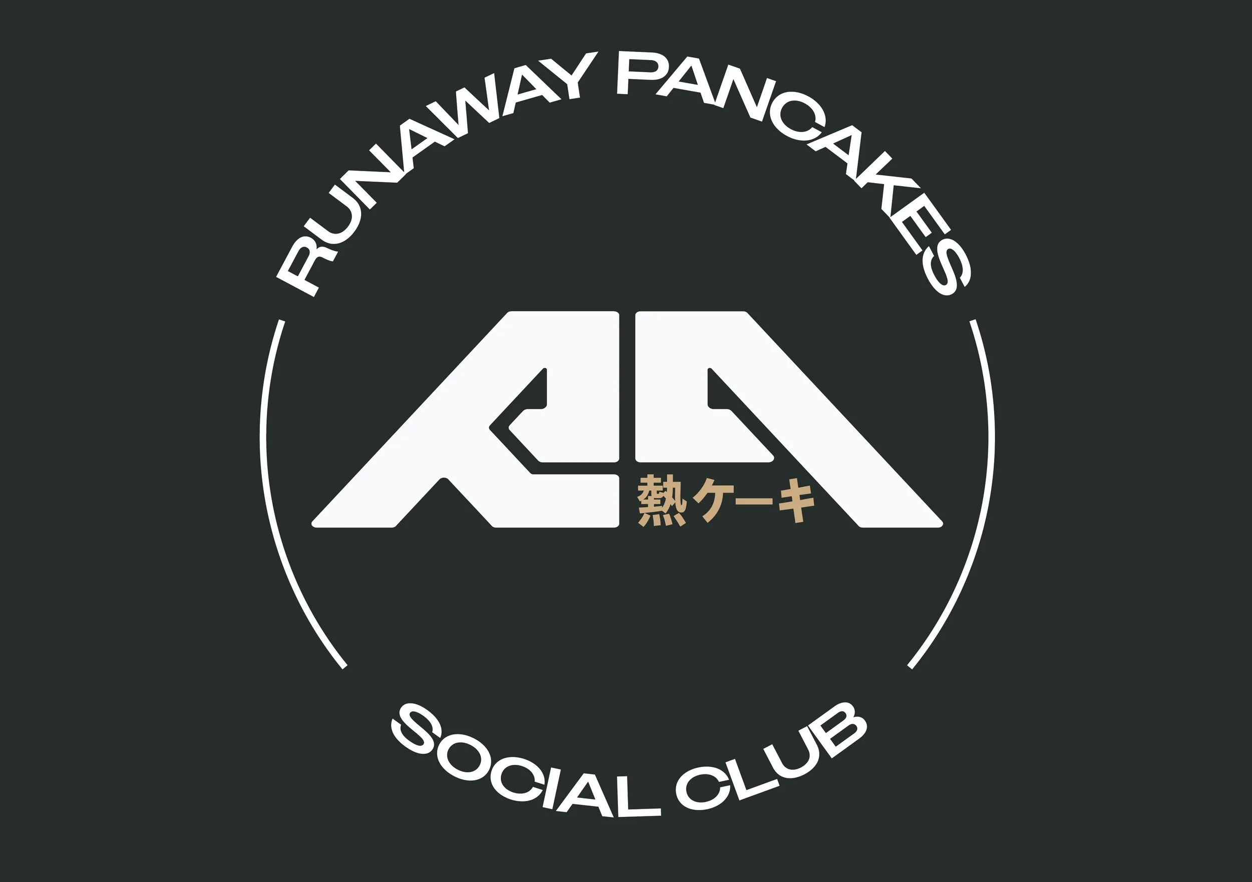
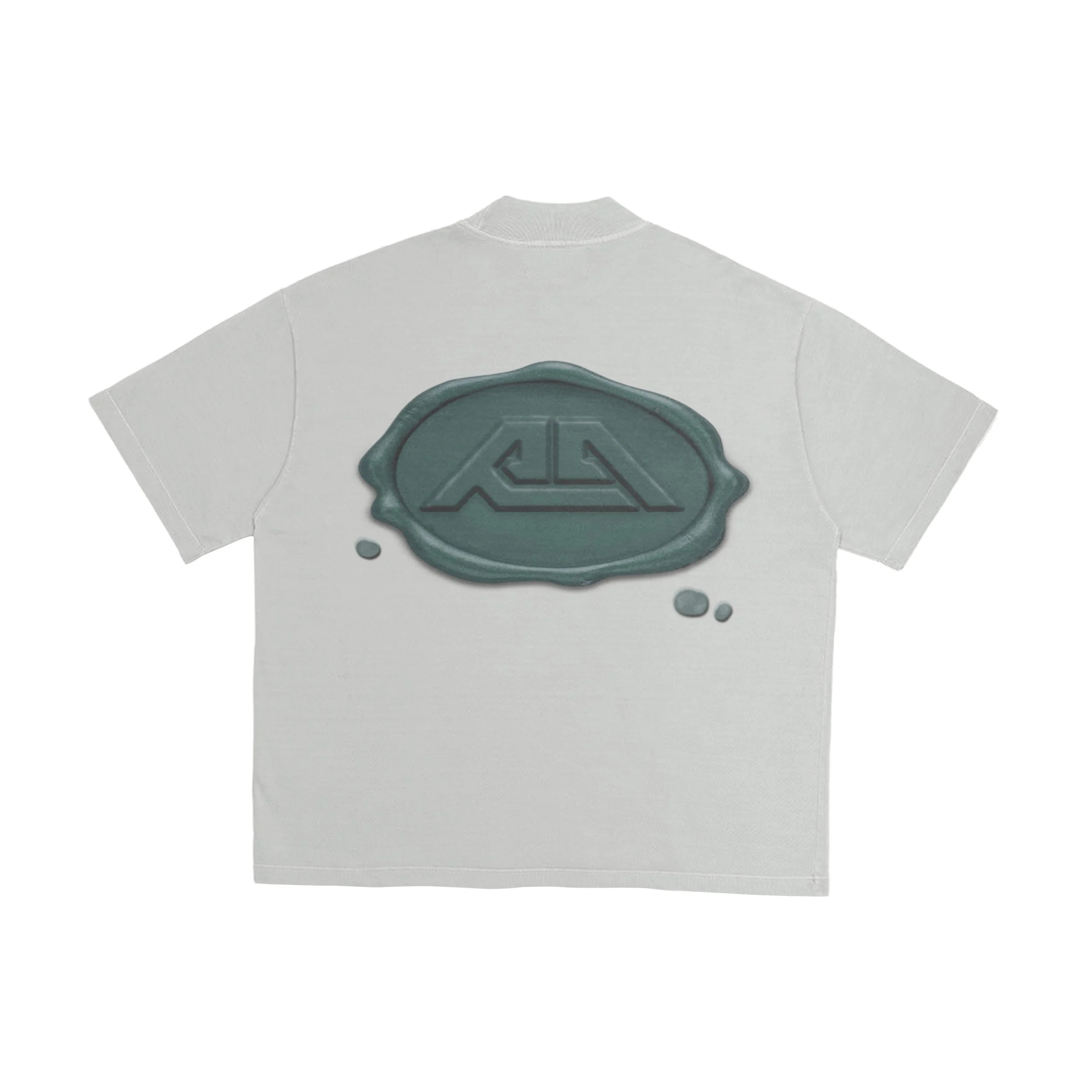
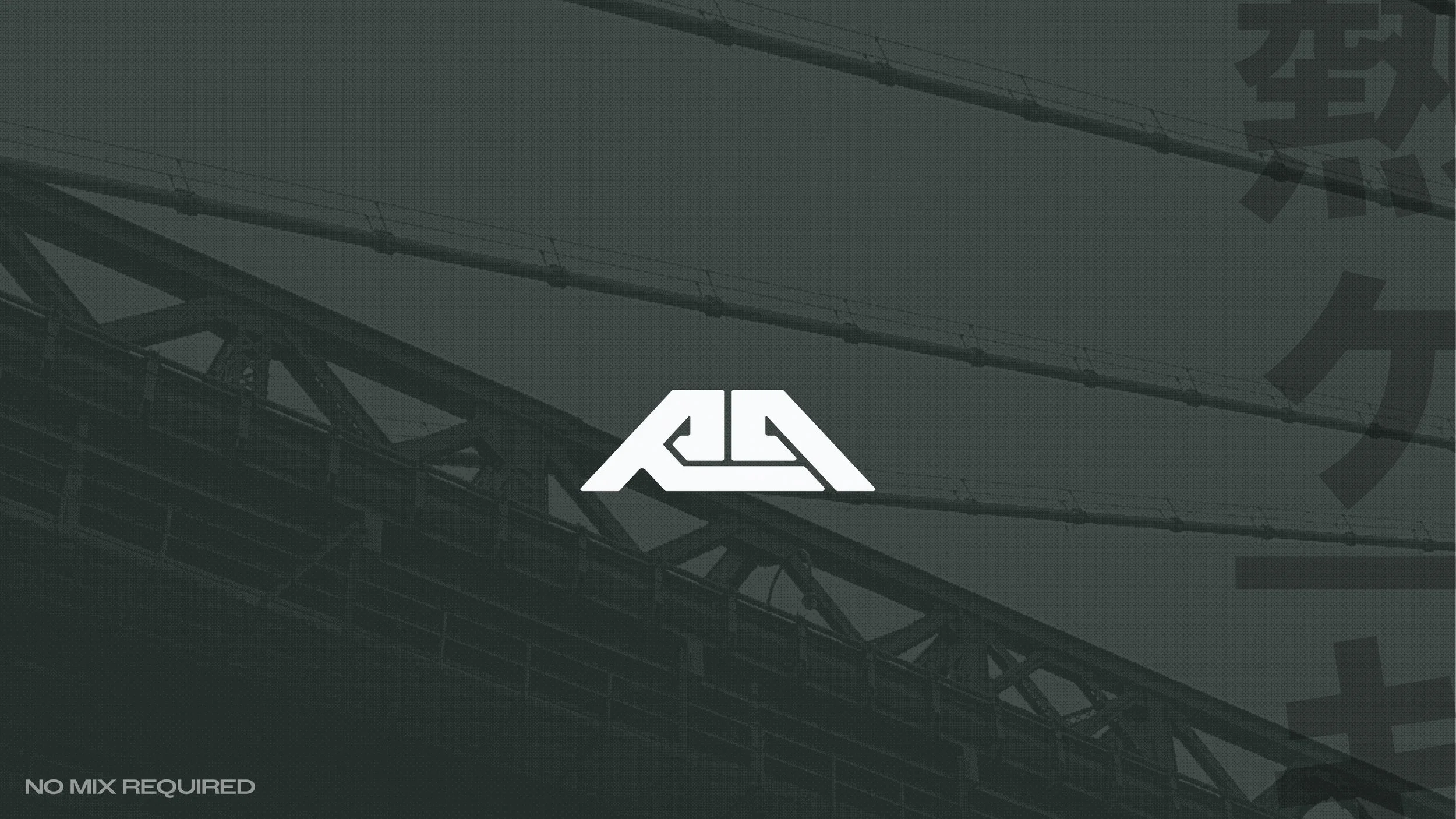
The custom wordmark features angular, mirrored letterforms, designed to feel engineered and fast. Paired with apparel, decals, and accessories, the full identity gives The Runaway Pancakes a cohesive, distinctive presence that captures the spirit, community, and adrenaline at the core of modern car culture.